Coin Dragon Deposit Kiosk Machine
Redesigning kiosk screens to increase transaction usage rates and allow quick onboarding of new services
Descriptors
It is a common to see spare change lying around tables or jars filled with coins as display piece. What could have been potentially started off as an organised display gradually accumulate into big heavy stacks that is too troublesome to take care of.
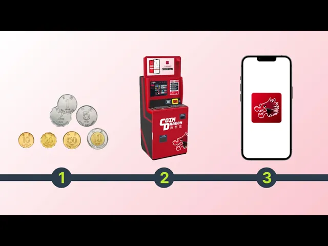
Coin Dragon operates deposit kiosk machine that accepts local coins and banknotes. The total sum would be deposited into the user’s choice of payment (such as bank account, transport card, retail vouchers, donation or bill payment).
Throughout their 5 years of operation, they have been refining their MVP product in 1 region market. The existing product does not convey the idea of scrolling to see the full extent of service options. Another goal is to allow more options to be added and a visual refresh to prepare for regional expansion.
This project started out with the contextual knowledge of operating for 5 years in Hong Kong. As the new software system gets developed, the operation service network also expanded concurrently to Singapore and Bangkok. Each region will have their own localisation settings and demands but the foundation basis of this project remains for all regions.
Homescreen as a means to convey usage
Users would have to select the deposit input method and preferred output method before doing any deposits. This 2 step flow could deter users from interacting and knowing more about the service. Given that it is a kiosk machine, people will tend to walk past it. Heads could turn to see what the machine is about, but the screen layout may not convey the full message.
The idea of a splash screen had floated around, and when we tested it, many users (in Hong Kong) did not know how to operate the screen even though there are text signalling to them to tap the screen to begin their transaction process.
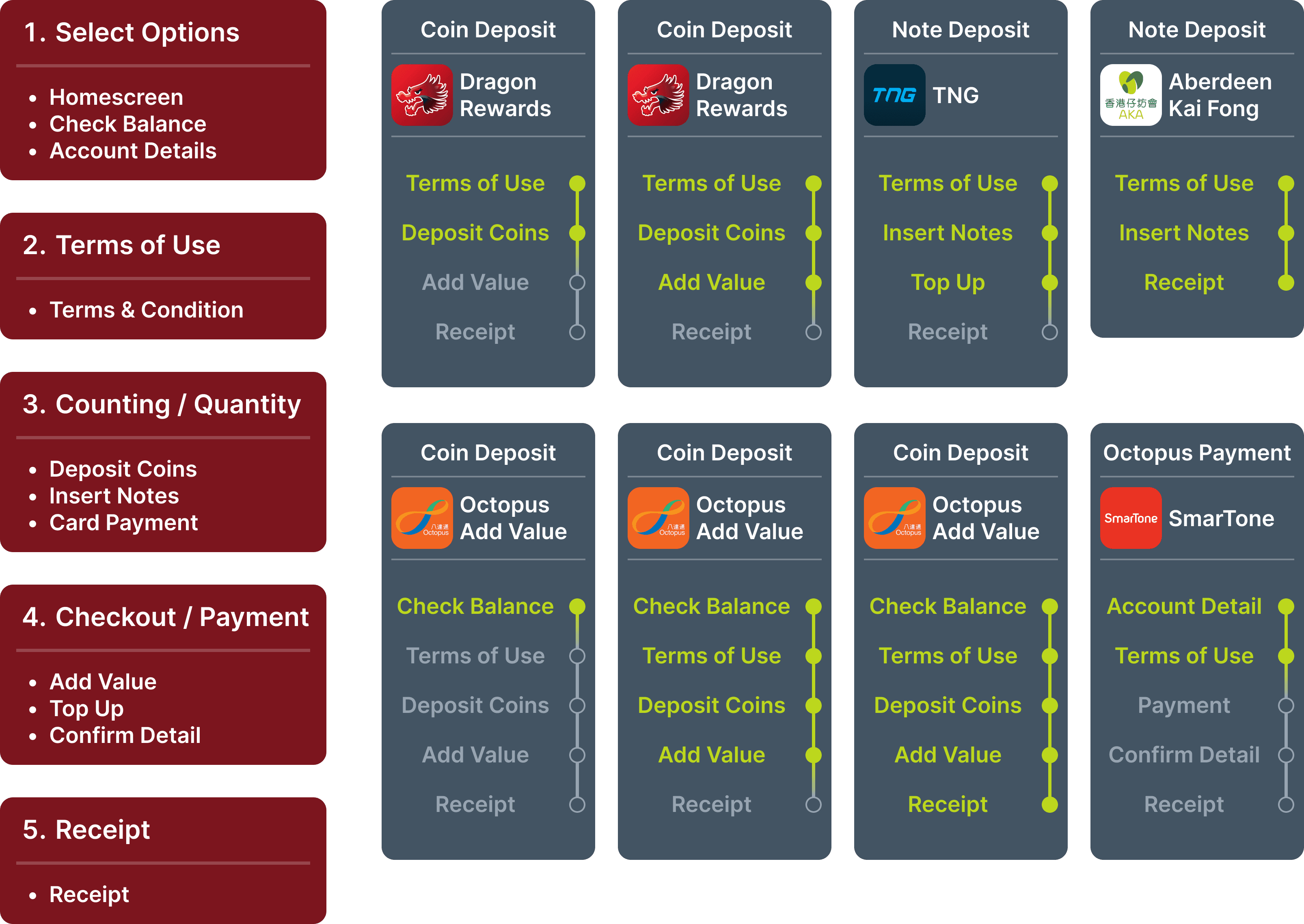
Streamlining systems flow for templated structure
The existing flow phases isn't very consistent. To make it more polished and templated structure, I went to re-look at the process flow of all the services. As a basis guideline, I based off the decision making process based off majority of the existing service flow and the stringent requirements of an existing service partner. We also want to show that the entire transaction process is very simple and not time consuming at all.
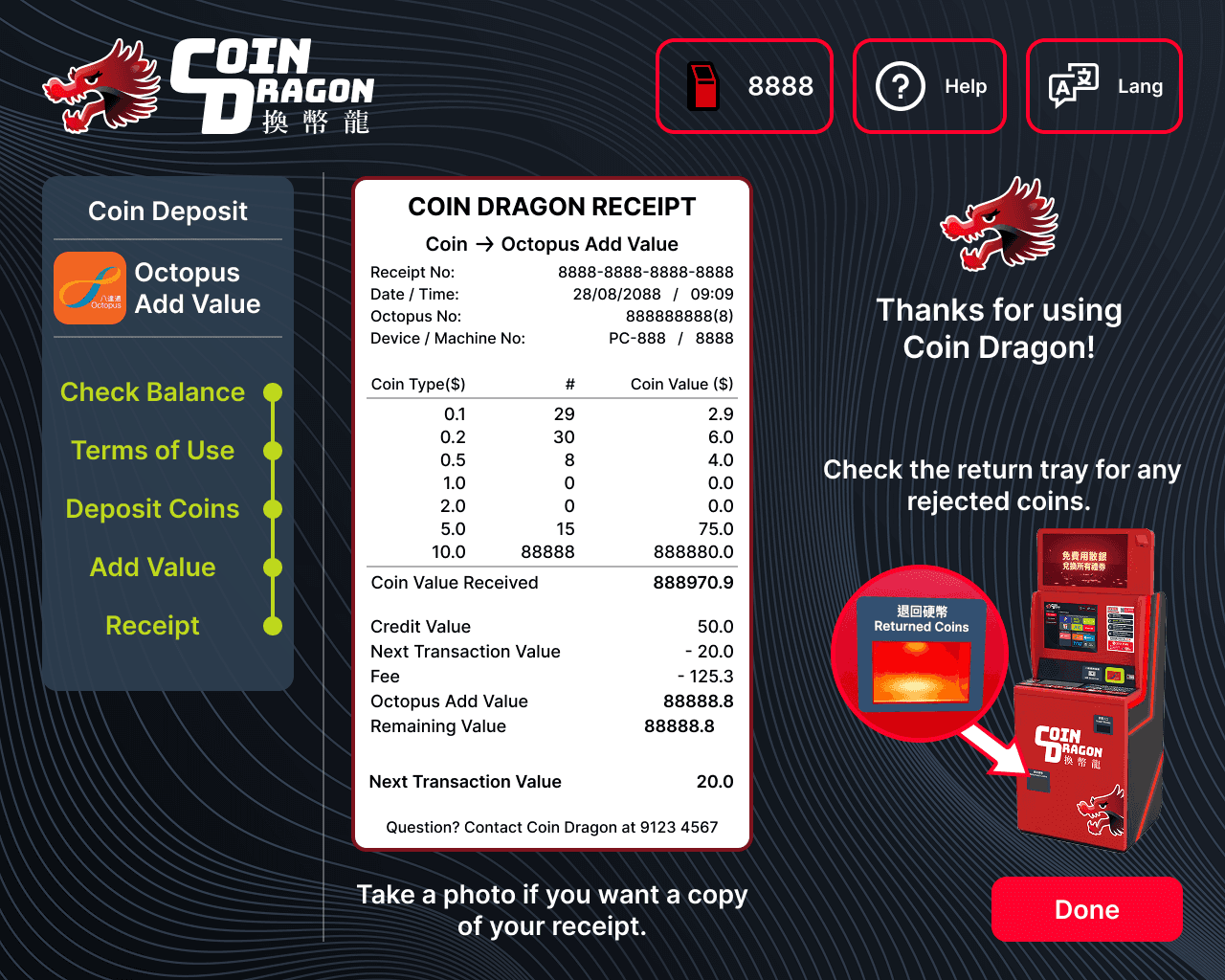
Transparent information display for a price sensitive demographic
When dealing with monetary objects, there needs to be a level of transparency and trust. Users would want to know the full calculation and the quantity volume. The histogram uses different colours to represent the physical value.
In Hong Kong, it is also prominent to see one decimal places in currency formatting. This is also to align with brand partnership deal requirements.